Tuesday, 22 May 2012

OUGD401 EVALUATION

1. What skills have you developed through this module and how effectively do you think you have applied them?
Throughout this module I feel that my research skills have developed further.  I have developed skills within presenting in a crit and understand good questions to ask to get the feedback you desire.  

2. What approaches to/ methods of design production have you developed and how have they informed your design development process?


3. What strengths can you identify in your work and how have/will you capitalise on these?


4. What weaknesses can you identify in your work and how will you address these in the future?


5. Identify 5 things that you will do differently next time and what do you expect to gain from doing these?

1.  Plan out my time better and never underestimate a workload.
2.  Practice essay writing as I struggle in this aspect a great deal.
3.  Seek out help when stuck in stead of leaving things to the last minute, this will help towards a stress-free working practice.


6. How would you grade yourself on the following areas:

Attendance: 4
Punctuality: 4
Motivation: 4
Commitment: 4
Quantity of work produced: 3
Quality of work produced: 2
Contribution to the group: 4

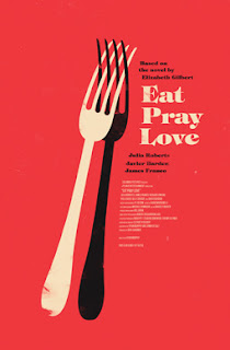
45 Designers// Film Theory

Olly Moss (born 1987) is an English artist, graphic designer and illustrator. He is best known for his re-imagining of movie posters. His work is regularly featured in the Empire magazine.  http://en.wikipedia.org/wiki/Olly_Moss


Saul Bass (May 8, 1920 – April 25, 1996) was a graphic designer and filmmaker, perhaps best known for his design of film posters and motion picture title sequences.


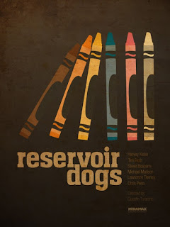
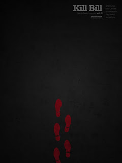
Similar to Olly Moss's redesign, these series by Ibraheem Youssef has a similar concept, but focused on Tarantino’s filmography.


This great conceptual experiment was created by Peter Stults. Peter is an illustrator/designer from New York. His inspiration came from Hartter.blogspot.com, where originally he saw an artist creating posters of films that, title wise, we were familiar with, but there was a slight difference.  http://koikoikoi.com/2012/01/15-movie-posters-from-an-alternate-universe/


Grzegorz Domaradzki is a painter, illustrator and designer from Poland. This series of posters of his favourite movies is amazing! Great technique, so rich in details and so cool in graphic solutions.  http://koikoikoi.com/2009/07/grzegorz-domaradzkis-movie-posters-remake/


45 Designers// Graffiti & Street Art

Robbo vs Banksy


King Robbo is an English underground graffiti artist who became more widely known following a graffiti war with Banksy.  There had been a previous meeting between Robbo and Banksy in the nineties during which Robbo claimed he slapped Banksy, a claim Banksy denied. A Channel 4 documentary "Graffiti Wars" about the feud was first shown in August 2011. - Wikipedia


Since Banksy made his name with his trademark stencil-style 'guerrilla' art in public spaces - on walls in London, Brighton, Bristol and even on the West Bank barrier separating Israelis and Palestinians - his works have sold for hundreds of thousands of pounds.

Read more: http://www.dailymail.co.uk/femail/article-1034538/Graffiti-artist-Banksy-unmasked---public-schoolboy-middle-class-suburbia.html#ixzz1vYFhRk4n


Miami Street Art: Epic Shepard Fairey wheat-paste street art work at Dorissa in Miami’s Design District.  http://www.globalgraphica.com/2009/03/22/shepard-fairey-in-miami-dorissa/


On Sunday ROA put up a great new mural on Chance Street in Shoreditch to mark his last night in London before jetting off to paint in Poland.  This piece adds to his growing repoitoire of animals around London and caps off an extended stay that saw him put up one more street piece a few weeks back (see below), but more significantly put together a fantastic installation based gallery show entitled Hypnagogia.  http://streetartlondon.co.uk/

Bricklane:


Shoreditch:


C215 has, in recent days bombarded Brick Lane with new pieces… in a similar vein to his last visit to London in July 2011.   Street Art London went out and hunted a few of their pieces down… there are probably one or two more still out there that we missed….  http://streetartlondon.co.uk/


Swoon uses traditional wood cut  techniques to render her evocative, ephemeral and realistic street art that draws inspiration from an array of historical and folk sources as well as people that she knows or meets on her travels.  http://streetartlondon.co.uk/

Monday, 21 May 2012

45 Designers// Advertising

Sony Bravia


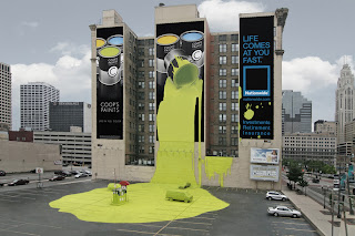
Ambient Media are an advertising team who go further than your average poster.  'From the conception to execution of Guerrilla Marketing, PR-Stunts, Product Sampling, Street Advertising, Outdoor Advertising or Ambient Media Campaigns, we utilise our wealth of experience and knowledge to bring brands to life!'


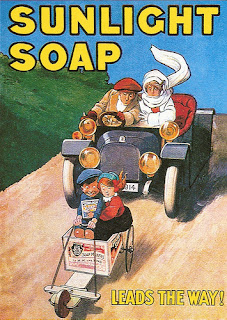
Unilever - Sunlight Soap.


Haddon Sunblom designed the internationally recognized santa/coca-cola brand.


45 Designers// Communication

Harry Beck - London Underground, communicating to thousands of people everyday from all over the world.


Kitchener - Your Country Needs You.  World War Propaganda
Britain declared war on Germany on 4 August 1914. The poster was designed by Alfred Leete and had first appeared as a cover illustration for London Opinion, one of the most influential magazines in the world, on 5 September 1914. A similar poster used the words "YOUR COUNTRY NEEDS YOU".[3] It is often wrongly referred to as "BRITONS WANTS YOU".


Design Soap.co.uk


45 Designers// Media Specificity

Yulia Brodskaya creates typography and image through the use of papercraft.  She (born in 1983, Moscow) is an artist and illustrator known for her handmade elegant and detailed paper illustrations. Originally from Russia (Moscow), she is now based in the UK. In 2004 Yulia moved from Moscow to UK where she continued her education in art, at the University of Hertfordshire, graduating with a Master of Art in Graphics Communication degree in 2006.  Wikipedia


Douglas Alves, Mixed Media Illustrations


45 Designers// Typography

STEFAN SAGMEISTER (1962-) is among today’s most important graphic designers. Born in 

Austria, he now lives and works in New York. His long-standing collaborators include the 

AIGA and musicians, David Byrne and Lou Reed.


Helvetica was developed in 1957 by Max Miedinger with Eduard Hoffmann at the Haas'sche Schriftgiesserei (Haas type foundry) of MünchensteinSwitzerland. Haas set out to design a new sans-serif typeface that could compete with the successful Akzidenz-Grotesk in the Swiss market. Originally called Neue Haas Grotesk, its design was based onSchelter-Grotesk and Haas’ Normal Grotesk. The aim of the new design was to create a neutral typeface that had great clarity, no intrinsic meaning in its form, and could be used on a wide variety of signage.


Erik Spiekermann (born May 30, 1947 in Stadthagen, Lower Saxony) is a German typographer and designer. He is a professor at the University of the Arts Bremen.  Spiekermann studied art history at Berlin's Free University, funding himself by running a letterpress printing press in the basement of his house.  Between 1972 and 1979, he worked as a freelance graphic designer in London before returning to Berlin and founding MetaDesign with two partners.


Si Scott – Hailing from Leeds, UK, Si Scott has developed a bit of a cult following online. He’s currently working with a few small design firms. His work demonstrates his taste for the ornate; it combines hand-drawn elements with modern font-making technologies.


Ed Fella (born 1938 in Detroit) is an artist, educator and graphic designer whose work has had an important influence on contemporary typography. Ed worked as a commercial artist designing brochures and illustrations. He practiced professionally as a commercial artist in Detroit for 30 years before receiving an MFA in Design from the Cranbrook Academy of Art in 1987.


45 Designers// High Culture vs Low Culture

High Culture vs Low Culture covers the feud between Graphic Design and Fine Art.  Fine Art largely being viewed as being High Culture and Graphic Design Low Culture.  Fine Art is seen to be better because it is elitist, only a select few can "understand" it whereas with Graphic Design it is designed to be understood by the masses.


Tracey Emin's Bed is a great example of High Culture.  Most people don't understand what it's about (ordinary folk) however there are a few who claim to understand.


'A consummate storyteller, Tracey Emin engages the viewer with her candid exploration of universal emotions. Well-known for her confessional art, Tracey Emin reveals intimate details from her life to engage the viewer with her expressions of universal emotions. Her ability to integrate her work and personal life enables Emin to establish an intimacy with the viewer.'
http://www.saatchi-gallery.co.uk/artists/artpages/tracey_emin_my_bed.htm


Margaret Calvert's nationally recognized Road Sign Design will be considered Low Culture as it communicates to the masses.  The Road Sign Design's are practically flawless and have a purpose, this makes me think that the mass view on high/low culture is warped.


The MacDonalds 'M' is considered low culture however it is recognized globally therefore surely doing a better job than a lot of fine art.