Showing posts with label OUGD503. Show all posts

Tuesday, 16 April 2013

Hellfire // Research

Hellfire is a pale bitter produced by Leeds Best Brewery and they want us to re-design the label to entice young people such as ourselves to buy the drink.  

The existing bottle design:

Useful Information:

5.2%
Made from hops
Must include Creative Networks Logo

Format and print requirements
Label Size 86 x 57 mm (allow 1.5mm Bleed)
Digital Artwork required in CMYK.
The label will be printed on self adhesive MC Primecoat.
Quantity 500 labels


UK Greetings Card Brief // Research

It was only when I went to the craft fair in the corn exchange the other day I decided to do the UK Greetings Card Brief.  I saw many beautiful hand-made cards that just have a much nicer quality than shop bought cards.  Unfortunately I wasn't allowed to take any pictures!

So here is a collection of cards I find aesthetically pleasing and inspirational:


This helped to inform my design as I love the use of fabric and sewing here and it inspired me to use felt.


Monday, 8 April 2013

Batiste Research

For one of my new flavours/ identities for batiste, I was thinking Batiste for Men.  Finding this article helped me to understand that there is an interest in dry shampoo for men.  The bottle design however just looks like the original batiste spray can, If I design a bottle which is more obviously for men then I think more men would buy the product.

http://www.thechapblog.com/

Batiste Dry Shampoo - Its also for blokes!

Hi Guys, for years I've watched my girlfriend use Batiste Dry Shampoo and always considered it to be a product for the girls. How wrong I was, there are now two Unisex cans of the cult product 'Fresh' and 'Brit' (Brit being exclusive to Superdrug). Apparently Batiste Original is also very popular with the boys too.

Batiste works by absorbing oil and product build-up in your hair and I was curious to know how effective it would be if you still have product in your hair from the day before. I used the original formula before I went into town to get my hair cut a few days ago and it did exactly what it said on the tin and I was able to go without wearing any of favourite hair paste. I think Batiste its a great substitute when you just don't have the time to wash your hair. It works better without any product in your hair but it's still reasonably effective if you do.

Out of the two, I prefer the Batiste Fresh, it just smells nicer. I want to try out the Batiste Brit now, it looks more Blokey.

Prices do range between £1.49-£3.49 and they're also available in a dinky travel sized bottle as well.

Please let me now your thoughts, any comments are appreciated.

Thanks for reading


The Chap:)

Friday, 29 March 2013

Batiste // Brand Research


The current range ^^


The idea of batiste is to help girls keep their hair beautiful when they're on the go, and keep it looking luscious in between washes.

The designs of the cans reflect current fashion trends and bright colours to make them attention grabbing with all the other products of the shelves out there.  

To me it is important to make the spray cans I design have 'stand out shelf appeal' as this is something that stood out to me when reading the brief as being really important.


D&AD brief - Batiste // Research

The Batiste Brief asks the designer to:


  • Make product a must have for every beauty toolkit
  • Make appealing to new customers
  • Make engaging to existing customers
  • Stand out shelf appeal
  • 4 new fragrances & identities
As the brief asks us to create 4 new fragrances & identities, I thought I'd better take a look at what already exists: 

  • Fresh
  • Cherry
  • Lace
  • Graffiti
  • Paisley
  • Red (for red hair)
  • Dark & Deep Brown (for brunettes)
  • Medium & Brunette (for brunettes)
  • Light & Blonde (for blondes)
  • XXL Volume
  • Wild
  • Blush
  • Original
  • Tropical
A picture from the website which shows all cans 


To keep my designs in keeping the the Batiste overall look, I am going to draw up a list of guidelines for myself to design by:

  • Pattern
  • Colourful
  • Bright
  • Keep logo's and information in the same place, just replace background image

While trying to stay in keeping with the brand, I need to make the cans stand out more and be more appealing to new and old customers.

Thursday, 28 March 2013

To Dry For Design Competition // Visual Research

Before beginning the To Dry For illustrative tea towel design competition I looked at pre-existing tea towels on their website that had been designed by other illustrators and came across some work that I feel that I share common interests with.  The designs were mostly quirky and un serious and very light - hearted :).


Here are the designs which I found on the site, some of which I recognized who designed them.


The one below reminds me that in the brief it asks us to be considerate of colour as the tea towels will be screen-printed.


Tea pots and tea cups and tea in general is very popular at the minute, I love it too, but I am going to steer away from this idea as it has been done so many times now.


I'd quite like my design to have a snappy quote or slogan like this, because people relate to words as well as image.


Designed by Julia Pott:


Thursday, 7 March 2013

Ella's Kitchen // Information for Tree Decorations


On the decorations cut out on the laser cutter, we wish to engrave information about the Ella's Kitchen Brand.  So far I have found information about:


As the decorations will be small and the information will be engraved in wood, the text size will have to quite a large point size (need to experiment).  I have decided to condense the information down to:

"We will recycle your Ella's Kitchen pouches for free and make them into new eco - friendly products"


I have condensed the information above to:

"We make sure our baby food appeals to all babies senses, with bright, colourful and squeezy packs"


"We use organic lemon juice in our food as most bugs can't survive in acidic environments"


Wednesday, 27 February 2013

Collaborative Brief // Ella's Kitchen

 A collection of information that we wish to communicate to the target audience.


How can Ella’s pouches have a long shelf life + keep their nutritional value?

Our 4 little secrets help us do what we do – create healthy, safe, tasty and long-shelf-life baby food.  Our process helps maintain as many of the nutrients as possible – just like you make at home. What we do is:
  1. Carefully balance our recipes to be sufficiently naturally acidic to be hostile for bugs but safe for babies’ tiny tummies.
  2. Flash-pasteurise the fruit + veg to kill any existing or dormant bugs.
  3. Fill the pouches hot, to ensure the pouches themselves are free from bugs.
  4. Draw a vacuum and add an inert gas into the top of the pouch, before we screw the caps on tightly. This means that there is no oxygen in the pouch to feed anything nasty in there!
 So now you know our secrets!

Organic food is more expensive than non-organic food. Why is it better?

  • We believe it’s better for your little one because…
Organic baby food contains far fewer additives. Among the additives banned by the Soil Association are hydrogenated fat, aspartame (artificial sweetener) and monosodium glutamate.
Organic food comes from carefully monitored sources with high standards in quality, and many people prefer organic food because they say it tastes better – we think your little one will too!
  • We believe it’s better for the environment because…
The UK government has said that organic farming causes lower pollution from sprays, produces less carbon dioxide – the main global warming gas – and less dangerous wastes. Organic foods also avoid Genetically Modified (GM) ingredients and crops.
  • We believe it’s better for animals because…
Organic farmers don’t routinely use antibiotics on their animals and they take the welfare of their animals very seriously under organic standards. The way organic food is produced protects the environment for wildlife, too. The benefits of the organic approach are acknowledged by animal welfare organisations such as Compassion in World Farming, as well as the UK government.


Where do the ingredients in Ella’s Kitchen products come from?

We care a lot about protecting our environment for our little ones in the future, so we try very hard to keep the travel miles of our ingredients to a minimum. However, to source yummy ingredients such as organic mangoes, we have to travel a little farther afield. All our ingredients are of the highest organic and Soil Association standard, with sustainability an important aspect for us.
We source our organic meat from the EU and the majority comes from the UK. Likewise with our products, we make these in the EU, including the UK.

Ella's Kitchen

While having a browse on Behance I came across these wooden fruit blocks which is similar to mine and Katie's idea for the veg to hang on the tree.  Considering our subject matter our designs will be more child like and will probably use primary colours.


I like the carefully painted detail on these blocks, it is similar to the illustrations for my Feel Good Drinks Project.


Tuesday, 26 February 2013

Collaborative Brief // Ella's Kitchen

The Ella's Kitchen website is a great source for information as they provide lots of information about their brand and products to keep parents happy and to ensure that their baby is getting what they need.  http://www.ellaskitchen.co.uk/

Stuff for the senses

At Ella’s Kitchen, our reason for being is to help kids enjoy eating healthy food.
We believe that, just as adults do, babies eat with all of their senses – so it’s not just the texture or taste that’s important. That’s why we make sure all our scrummy, 100% organic baby food appeals to all their senses, with bright, colourful, squeezy packs that we know they love to grab and squish.

The good stuff we do

Hi,
I’m Ella’s mum. It’s really important to all of us here at Ella’s Kitchen that we make our food as good as it can be, but also that we try to be as environmentally + socially responsible as possible. As well as helping little ones grow up big and strong, we want to do our bit to look after the planet they live on and to give something back to kids around the world.
Take a peek at all the good stuff we do and find out more about why we really are good in every sense.


Alison
Ella’s mum x

Consumer Forum
 
We are over the moon to be one of the founding members of the Consumer
Forum, which has been set up by like-minded, entrepreneurial UK companies to
promote and celebrate excellence in customer relations, and the benefits of
building businesses around what the consumer wants. We are working with
other exciting brands and public bodies, sharing our experience from chatting
with mums + dads, and seeking out new ways of creating great customer service
to spread to the wider business community. 

Food Donations
 
Occasionally, we get overexcited and make too many of our delicious
products. Rather than throw these away, we believe that they
should go to vulnerable children who would really benefit from
them. That’s why we’ve teamed up with some people who can help
us get our products to them.
We work with FareShare, who collect and redistribute food to disadvantaged
people in communities around the UK. Every day, an average of 29,000 people
benefit from the service FareShare provides. In 2010, our donations contributed towards 30,120 meals for
vulnerable and disadvantaged people in the community.
We also, from time to time, donate our products to a local charity, Feed the
Children, who send them out to children in need around the world. Some places
where our donations have been sent include the Rajanpur District of Pakistan, to
help following the 2010 flood disaster, while our breadsticks have been enjoyed
by school children in Liberia.. 


Wednesday, 21 November 2012

YCN Brief // Visual Research

Feel Good Drinks Branding:


Below is an image that came with the project pack, so it must mean that it is the most up to date branding for feel good.  It is my job to make it stand out more on the shelf and make people 'feel good.'  I intend to use the knowledge I've gained in colour theory to help the labels make people smile, while still keeping in mind the natural idea behind the brand - eg no fluorescent colours!


Pre-existing advertisements for the brand.

The branding is very natural, using muted colours and quite playful with the spots and banners and little characters.  I think it looks good and trustworthy because of this.


These are even more playful and surely will help people 'feel good,'  just the bottle that needs a little work.


Other similar brands that are out there:

Froosh, froosh seems to be a drink aimed at graphic designers but who knows, I don't want to just use typography in my designs which will then probably limit my target market.


Innocent Smoothies


Every innocent smoothie you buy with a woolly hat, 25p will be donated to Age UK.  This will definitely entice people into buying the product because the hats are quirky, fun and cute, and donating money to charity is an added bonus.


Vitamin Water has more of a medical look than the other drinks, this is something I want to avoid throughout my designs.


'This water' has simple clean and fresh packaging design however they aren't particularly outstanding on a shelf.  The small illustrations are nice but they also seem irrelevant.


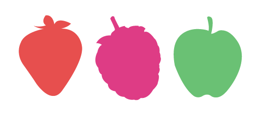
Examples of Good Food/Drinks Packaging:

Designed by Yunyeen Yong, thinking outside the box here.  Interesting format and good use of colour.


Clear & Simple, not too much information on the package makes it easy on the eye.


 Interesting concept below, I want these!